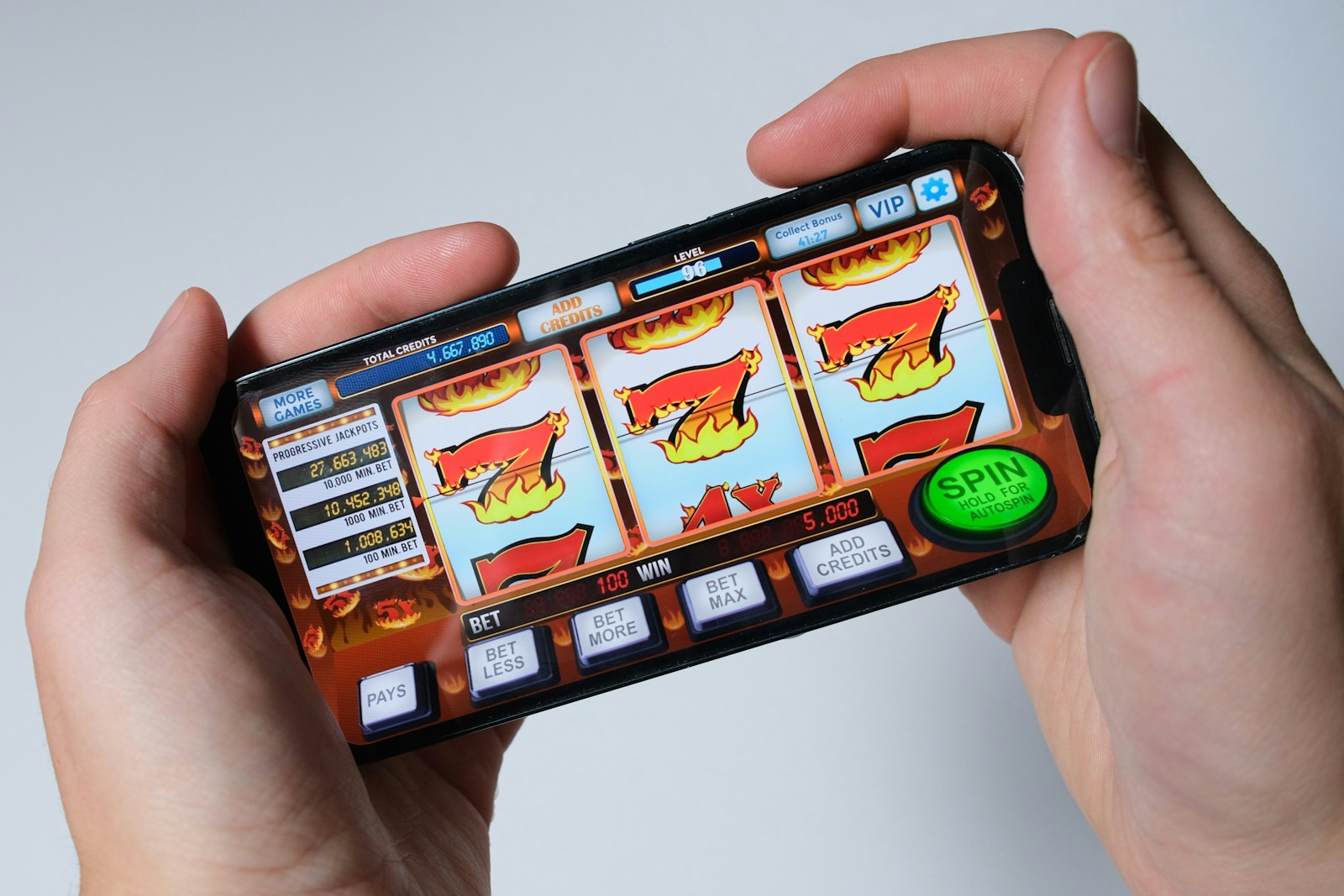
You’ve seen it: a casino app turns a two-minute check-in into a nightly ritual. That “stickiness” isn’t luck, it’s design. While you’re not building a slot machine, you can borrow the mechanics that make casino apps magnetic and apply them ethically to your product. The goal isn’t manipulation: it’s reducing friction, reinforcing progress, and delivering value at the exact moment users want it. Below are five lessons you can adapt today to build sticky user habits, without crossing lines or burning trust.
Lesson 1: Craft Variable Rewards That Reinforce Mastery
Casino apps thrive on variable rewards, the unpredictable payoffs that keep people curious. But you don’t need flashing jackpots. You need variability that rewards learning, contribution, or completion.
Here’s the key: pair variability with mastery. If the win feels random, you get a dopamine blip. If the win confirms skill, you get loyalty.
Try this:
- Layer predictable progress with occasional delightful surprises. For example, after completing three workouts, you always unlock a new routine (predictable), but sometimes you also get a limited badge, an expert tip, or a short motivational clip (variable).
- Use tiered reward pools tied to difficulty. As users tackle more advanced tasks, the surprise rewards become more meaningful, access to premium insights, priority features, or community spotlights.
- Make outcomes legible. After a “win,” reflect why it happened: “You unlocked this because you improved your pace by 8%.” Clarity converts chance into mastery.
What to avoid: pure randomization divorced from effort. If someone completes a tough streak and receives a trivial sticker, you’ve taught them effort doesn’t matter. Keep the surprise: respect the work.
Lesson 2: Build Effortless Action Loops And Clear Next Steps
Casino apps minimize the cognitive lift between intention and action: tap, spin, feedback, repeat. Your product should create similarly smooth loops, but anchored to user goals.
Design your loop in four beats:
- Trigger: a cue that’s timely and relevant.
- Micro-action: the smallest meaningful step to move forward.
- Instant feedback: a visible, sensible response.
- Clear next step: guidance that narrows ambiguity.
A practical example for a learning app: You get a nudge at your chosen study time (trigger). You’re taken straight to a 3-minute drill (micro-action). You see accuracy, time, and one specific tip (feedback). You’re then prompted to “Lock it in with a quick recap” or “Level up to a tougher set” (clear next step). No dead ends, no hunting.
Tactics that help:
- Preload context so each session opens where you left off, no selection screen unless you ask for it.
- Use action-led CTAs. Replace vague “Continue” with “Review 5 key terms” or “Draft first paragraph (2 mins).”
- Collapse steps. If you can combine two confirmations into one, do it.
And don’t bury the exit. Easy-in, easy-out increases trust, which ironically keeps people coming back.
Lesson 3: Use Streaks And Progression With Soft Recovery
Streaks are rocket fuel, until they become guilt traps. Casino apps balance progression with ways to recover so a single miss doesn’t nuke motivation.
Use streaks, but build safety nets:
- Soft grace windows. If a user misses a day, let them restore the streak within 24–48 hours by completing a short “make-good” task. You preserve momentum without cheapening the effort.
- Partial credit. When life happens, acknowledge it. If they complete 60% of a session, count it as a “save” rather than a failure. Progress bars should inch forward, not snap back to zero.
- Seasonality over infinity. Long, endless streaks turn punitive. Break the calendar into “seasons” (e.g., monthly arcs) with meaningful milestones and resets. Celebrate season completions with summaries and highlights.
Visuals matter too. Show additive growth: cumulative minutes practiced, projects shipped, or lessons mastered. When you visualize competence, not just calendar compliance, you reinforce identity: “I’m the kind of person who does this.”
One more thing: Never hide the rules. If streak recovery exists, explain exactly how it works. Users accept constraints when they feel fair and transparent.
Lesson 4: Personalize Triggers, Timing, And Feedback
Casino apps tailor timing to when you’re most likely to engage. You should, too, but with consent and guardrails.
Personalize responsibly:
- Timing: Let users pick preferred windows and quiet hours. Then adapt nudges based on observed patterns: “You usually focus best around 8:30 PM, want to make that your study slot?”
- Channel: Meet people where they want to be reached, push, email, SMS, or in-app only. Default to less intrusive.
- Frequency caps: Set hard limits. A truly sticky habit doesn’t require constant poking.
Make feedback specific and motivating:
- Compare you to you. “You edited 12% faster than last week” is more helpful than leaderboards for most users.
- Use intent-aware copy. If someone selected “learn piano for 15 minutes/day,” reflect that back: “Nice, 15 minutes logged. Want to add a chord drill while it’s fresh?”
- Highlight meaningful deltas. Instead of generic “Great job.”, say, “Your error rate dropped from 14% to 9%, that’s like saving 3 minutes per session.”
You can also recommend next steps that feel like a personal coach: “Based on your last three sessions, a 5-minute warm-up improves accuracy. Want to auto-start it?” The feeling that the product sees and supports the person, not just the metric, builds durable habits.
Lesson 5: Design Social Proof For Belonging, Not Pressure
Casino apps showcase wins and near-wins to suggest “people like you are active now.” In your product, use social proof to foster belonging, not FOMO-induced stress.
Do this well by being selective and human:
- Small, credible signals: “2 teammates wrapped their drafts today” lands better than “Thousands are writing now.” Micro-social proof feels relevant.
- Opt-in visibility: Let users choose what to share, milestones, streaks, or lessons learned. Offer private-by-default settings.
- Contextual nudges: Surface community when it helps the task. During a tough module, show “Most learners struggled here, here’s the trick that worked.” That normalizes difficulty and offers help.
Design formats that invite contribution:
- Lightweight reactions (“I used this tip and cut my time in half”).
- Peer templates or checklists users can remix.
- Rotating community spotlights that celebrate effort, not just elite outcomes.
Avoid public shaming mechanics. Don’t broadcast missed streaks or leaderboard drops. Social features should make people feel supported and seen, not ranked and embarrassed. If you wouldn’t announce it in a kind team meeting, don’t announce it in your product.
Conclusion
Sticky user habits aren’t accidents. They’re the result of crisp action loops, rewards that respect effort, progression with humane recovery, personalization that feels like coaching, and social features that build community. Borrow the best of casino app design, but aim it at mastery and meaning.
If you do one thing this week, map your core loop. Identify the trigger, the smallest action, the feedback, and the next step. Then ask: Where can you add a moment of delight tied to progress? Where can you soften the fall without erasing standards? Layer those changes carefully, watch the data, and listen to your users.
Build for trust. When your product helps people become who they want to be, they don’t need a nudge, they return because it feels right.
No responses yet